JavaPlus
Rebrand & Product Launch
Transforming a nootropic cold brew into a modern, high-performance, healthy-alternative, beverage brand.

OVERVIEW

JavaPlus began as a full rebrand of an existing
product called JavaBrain.
The drink was strong.
The identity wasn’t.
MY ROLE: lead the
creative/brand strategy
for the launch.
How it looks,
lives and breathes.
rename the product - develop visual identity & logo -
design packaging & flavor labels - create all product
photography & Video assets
We needed a brand that felt sharp, intentional,
and ready to compete — something clean, modern,
and instantly recognizable.
JavaPlus became that brand.


Naming
“JavaPlus” communicated improvement, mental clarity, and daily performance in one simple word.
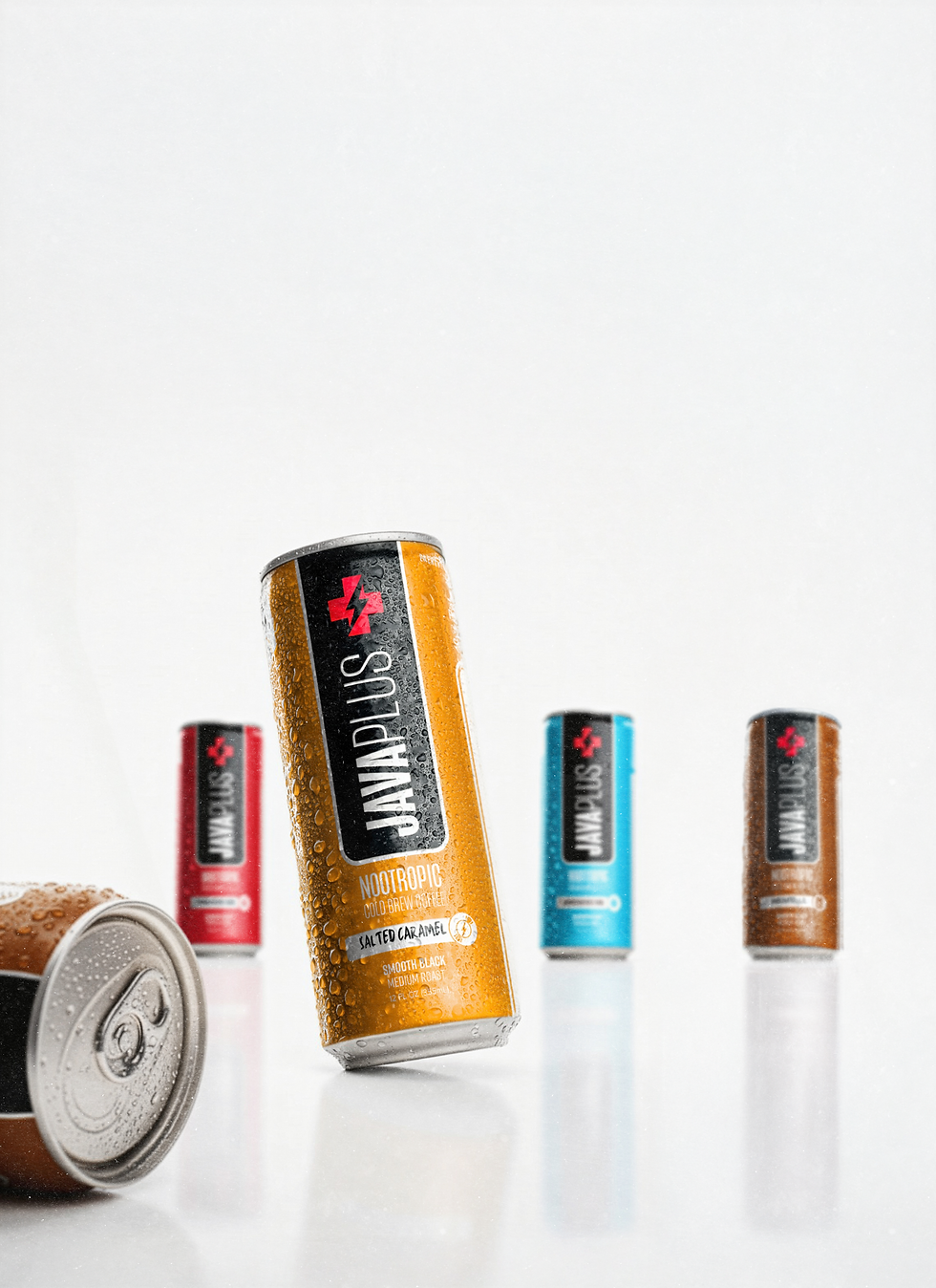
Product Design
We created a color-blocked system that made each flavor stand out while staying cohesive as a lineup.
Creative Direction
A modern, crisp visual language built around energy, motion, and clarity—hero shots, lifestyle imagery, and conceptual visuals used across retail and digital.
Sales & Launch Materials
A full pitch deck introduced the brand to buyers and partners using the new story, identity, and visuals.
THE APPROACH
We built the world of JavaPlus around four ideas: clarity, simplicity, energy, and performance.


THE OUTCOME
JavaBrain became JavaPlus —
a brand with purpose, clarity,
and a visual system built for scale.
The launch delivered:
-
New name + identity system
-
Packaging for all flavors
-
Full product photography Mockups
-
Messaging + tone direction
-
A retail / launch deck
-
Campaign-ready creative assets


JavaPlus now prepares to enter the market with a new outlook and story that finally match the quality of the product itself.